Flutter의 레이아웃에 대해 다루고 있습니다.
2022. 9. 25 최초작성
다음 글을 바탕으로 작성되었습니다.
https://docs.flutter.dev/development/ui/layout
관련 포스트
MacBook M1에 iOS와 Android를 위한 Flutter 개발 환경 만들기
https://webnautes.tistory.com/2027
Windows에서 Flutter 개발환경 만들기
https://webnautes.tistory.com/2057
레이아웃을 사용하면 위젯을 구성하여 더 복잡한 위젯을 만들 수 있습니다. 예를 들어 아래의 첫번째 스크린샷은 3개의 아이콘 아래에 레이블을 배치했습니다. 두 번째 스크린샷은 레이아웃을 사용하여 어떻게 아이콘과 레이블을 구성했는지를 보여줍니다.
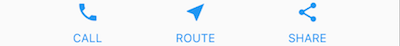

위 스크린샷의 구성을 트리구조로 나타내면 아래와 같습니다. 분홍색으로 표시된 컨테이너는 하위 위젯을 포함하며 패딩, 여백, 테두리, 배경색 등을 추가할 수 있습니다.
트리의 맨 아래에 있는 각 Text 위젯은 여백을 추가하기 위해 컨테이너의 자식 위젯으로 배치됩니다.
아이콘 위젯과 텍스트 위젯이 포함된 컨테이너 위젯은 Column 위젯의 자식이 되어 위 스크린샷처럼 아이콘 아래에 텍스트가 배치되도록 합니다.
아이콘 위젯과 텍스트 위젯이 포함된 3 개의 Column 위젯은 Row 위젯으로 묶여 위 스크린샷처럼 한줄에 3개가 배치되록 합니다.
여백을 추가하기 위해 Row 위젯은 다시 Container 위젯의 자식 위젯이 됩니다.
매터리얼(Material) 앱인지 여부에 따라 기본 코드가 달라집니다.
매터리얼 앱의 경우 Scaffold 위젯을 사용할 수 있습니다. Scaffold 위젯에는 Appbar, 배경색 등이 디폴트로 추가되어 있습니다. 화면에 출력할 Text 위젯이 포함된 Center 위젯을 Scaffold 위젯의 body 속성에 추가할 수 있습니다.
| import 'package:flutter/material.dart'; class MyApp extends StatelessWidget { const MyApp({super.key}); @override Widget build(BuildContext context) { return MaterialApp( title: 'Flutter layout demo', home: Scaffold( appBar: AppBar( title: const Text('Flutter layout demo'), ), body: const Center( child: Text('Hello World'), ), ), ); } } void main() { runApp( MyApp() ); } |

머티리얼 앱이 아닌 경우 build() 메서드에 Center 위젯을 추가할 수 있습니다. 배경색을 흰색으로 하기 위해 Center 위젯이 Container 위젯에 포함되어 있습니다.
| import 'package:flutter/material.dart'; class MyApp extends StatelessWidget { const MyApp({super.key}); @override Widget build(BuildContext context) { return Container( decoration: const BoxDecoration(color: Colors.white), child: const Center( child: Text( 'Hello World', textDirection: TextDirection.ltr, style: TextStyle( fontSize: 32, color: Colors.black87, ), ), ), ); } } void main() { runApp( MyApp() ); } |
기본적으로 머티리얼 앱이 아닌 경우에는 AppBar, 배경색 등이 디폴트로 포함되어 있지 않습니다. 직접 추가해줘야 합니다.
앱을 실행하면 아래 스크린샷처럼 Hello World가 화면에 표시됩니다.

위젯을 세로/가로로 배치
일반적인 레이아웃은 자식 위젯을 세로 또는 가로 방향으로 일렬로 배치하는 것입니다. Row 위젯을 사용하여 자식 위젯을 가로 방향으로 일렬로 배치하거나 Column 위젯을 사용하여 자식 위젯을 세로 방향으로 일렬로 배치할 수 있습니다.
아래 스크린샷의 레이아웃은 Row 위젯이 메인 위젯으로 구성됩니다. Row에는 두 개의 자식 위젯이 있습니다. 왼쪽에 Column 위젯이 있고 오른쪽에 이미지 위젯이 있습니다.

왼쪽 Column 위젯에는 Column 위젯과 Row 위젯이 아래 그림처럼 중첩되어 있습니다.
mainAxisAlignment, crossAxisAlignment 속성을 사용하여 Row 위젯이나 Column 위젯이 자식 위젯을 정렬하는 방법을 제어합니다. Row 위젯의 경우 주축(main axis)은 수평 방향이 되고 교차축(cross axis)은 수직 방향이 됩니다. Column 위젯의 경우 주축은 수직방향이 되고 교차축은 수평방향이 됩니다.

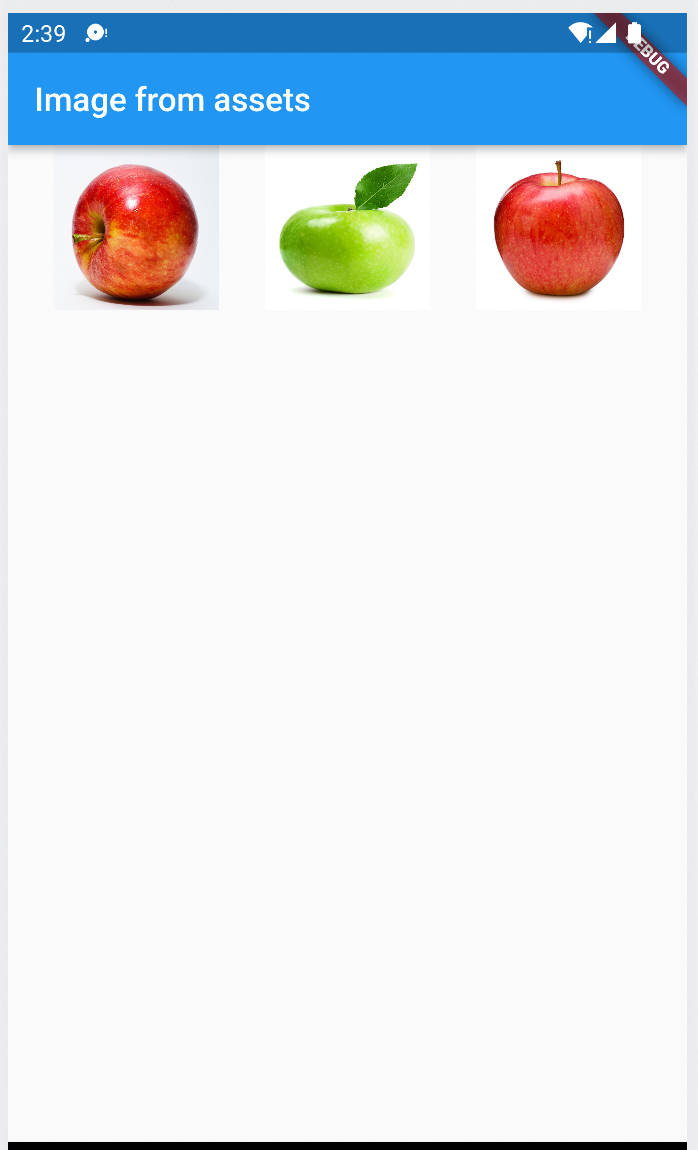
아래 예제 코드는 3장의 사과 이미지를 Row 위젯을 사용하여 가로로 배치하여 보여줍니다.
진행하기 전에 프로젝트에 이미지를 추가하여 사용하는 방법을 다음 포스트에서 참고하세요.
Flutter 프로젝트에 이미지 파일 추가하여 사용하기
| import 'package:flutter/material.dart'; void main() => runApp(MyApp()); class MyApp extends StatelessWidget { @override Widget build(BuildContext context) { return MaterialApp( home: Scaffold( appBar: AppBar( title: Text("Image from assets"), ), // Row - 자식 위젯을 가로 방향으로 나란히 배치합니다. body: Row( // MainAxisAlignment.spaceEvenly - 같은 크기로 위젯 사이에 공백을 추가합니다. mainAxisAlignment: MainAxisAlignment.spaceEvenly, // 자식 위젯으로 이미지 3장을 추가합니다. children: [ Image.asset('assets/images/apple1.jpeg', width:100, height:100, fit:BoxFit.fill), Image.asset('assets/images/apple2.jpeg', width:100, height:100, fit:BoxFit.fill), Image.asset('assets/images/apple3.jpeg', width:100, height:100, fit:BoxFit.fill), ], ), ), ); } } |
아래 예제 코드는 3장의 사과 이미지를 세로로 배치하여 보여줍니다.
| import 'package:flutter/material.dart'; void main() => runApp(MyApp()); class MyApp extends StatelessWidget { @override Widget build(BuildContext context) { return MaterialApp( home: Scaffold( appBar: AppBar( title: Text("Image from assets"), ), // Column - 자식 위젯을 세로 방향으로 나란히 배치합니다. body: Column( // MainAxisAlignment.spaceEvenly - 같은 크기로 위젯 사이에 공백을 추가합니다. mainAxisAlignment: MainAxisAlignment.spaceEvenly, // 자식 위젯으로 이미지 3장을 추가합니다. children: [ Image.asset('assets/images/apple1.jpeg', width:100, height:100, fit:BoxFit.fill), Image.asset('assets/images/apple2.jpeg', width:100, height:100, fit:BoxFit.fill), Image.asset('assets/images/apple3.jpeg', width:100, height:100, fit:BoxFit.fill), ], ), ), ); } } |

위젯 크기 조정
레이아웃이 너무 커서 장치에 맞지 않으면 아래 스크린샷처럼 영향을 받는 가장자리를 따라 노란색 및 검은색 줄무늬 패턴이 나타납니다. 다음은 너무 넓은 행의 예입니다.

Expanded 위젯을 사용하여 높이나 너비에 맞게 위젯의 크기를 조정할 수 있습니다.
아래 예제는 이미지 너비가 너무 넓은 문제를 해결하기 위해 이미지 위젯을 Expanded 위젯에 포함시켜 사용합니다.
| import 'package:flutter/material.dart'; void main() => runApp(MyApp()); class MyApp extends StatelessWidget { @override Widget build(BuildContext context) { return MaterialApp( home: Scaffold( appBar: AppBar( title: Text("Image from assets"), ), // Row - 자식 위젯을 가로 방향으로 나란히 배치합니다. body: Row( // CrossAxisAlignment.center - 자식 위젯을 가운데 정렬합니다. crossAxisAlignment: CrossAxisAlignment.center, children: [ // Expanded 위젯의 자식 위젯으로 이미지 위젯을 추가하면 크기를 적절하게 조정해주기 때문에 이미지가 잘리는 문제를 해결해줍니다. Expanded( child: Image.asset('assets/images/apple1.jpeg'), ), Expanded( child: Image.asset('assets/images/apple2.jpeg'), ), Expanded( child: Image.asset('assets/images/apple3.jpeg'), ), ], ), ), ); } } |

가운데 있는 이미지가 다른 이미지보다 2배 크게 보이도록 하는 예제 코드입니다. 이를 위해 Expanded 위젯의 flex 속성을 사용합니다. 기본 flex 속성값은 1입니다.
다음 예제 코드는 중간 이미지를 두배 크게 하기 위하여 Expanded 위젯의 flex 속성을 2로 설정합니다.
| import 'package:flutter/material.dart'; void main() => runApp(MyApp()); class MyApp extends StatelessWidget { @override Widget build(BuildContext context) { return MaterialApp( home: Scaffold( appBar: AppBar( title: Text("Image from assets"), ), // Row - 자식 위젯을 가로 방향으로 나란히 배치합니다. body: Row( // CrossAxisAlignment.center - 자식 위젯을 가운데 정렬합니다. crossAxisAlignment: CrossAxisAlignment.center, children: [ // 디폴트 flex 속성값은 1입니다. Expanded( child: Image.asset('assets/images/apple1.jpeg'), ), // flex 속성을 2로 설정하여 다른 위젯보다 2배 커보이도록 합니다. Expanded( flex: 2, child: Image.asset('assets/images/apple2.jpeg'), ), // 디폴트 flex 속성값은 1입니다. Expanded( child: Image.asset('assets/images/apple3.jpeg'), ), ], ), ), ); } } |

인접 위젯을 하나로 묶기
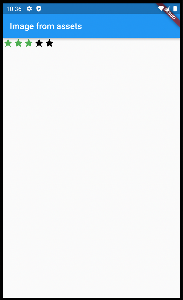
기본적으로 Row 위젯이나 Column 위젯은 주축을 따라 자식 위젯을 배치후, 여유 공간을 많이 둡니다. 자식 위젯들이 인접하게 붙어서 배치하도록 하고 싶으면 mainAxisSize 속성을 MainAxisSize.min으로 설정하면 됩니다.
아래 코드는 이 속성을 사용하여 별 아이콘을 하나로 묶습니다.
| import 'package:flutter/material.dart'; void main() => runApp(MyApp()); class MyApp extends StatelessWidget { @override Widget build(BuildContext context) { return MaterialApp( home: Scaffold( appBar: AppBar( title: Text("Image from assets"), ), // Row - 자식 위젯을 가로방향으로 나란히 배치합니다. body:Row( // MainAxisSize.min - 자식 위젯 사이의 여유공간을 최소로 합니다. mainAxisSize: MainAxisSize.min, // 자식 위젯으로 별 다섯개를 추가합니다. children: [ Icon(Icons.star, color: Colors.green[500]), Icon(Icons.star, color: Colors.green[500]), Icon(Icons.star, color: Colors.green[500]), const Icon(Icons.star, color: Colors.black), const Icon(Icons.star, color: Colors.black), ], ), ), ); } } |
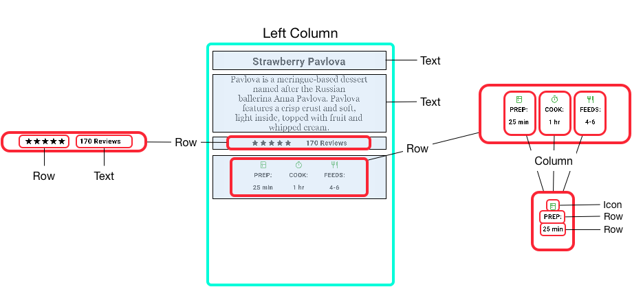
Row, Column 위젯을 중첩하기
레이아웃 프레임워크를 사용하면 필요한 만큼 행과 열 내부에 행과 열을 중첩할 수 있습니다.

위 스크린샷에서 빨간색 사각형으로 표시한 부분은 두 개의 행으로 구현됩니다. 첫번째 행에는 별 5개와 리뷰 수가 표시됩니다. 두번째 행에는 아이콘과 텍스트로 구성된 3개의 열이 포함되어 있습니다.
첫번째 줄을 트리로 표시하면 다음과 같습니다. 별 아이콘 5개를 Row 위젯을 사용하여 한줄로 묶어주고 텍스트와 한줄로 묶어주기 위해 다시 Row 위젯에 포함시킵니다. Container는 좌우 공백을 위해 추가됩니다.

두번째 줄을 트리로 표시하면 다음과 같습니다. 아이콘과 텍스트를 세로로 배치하기 위해 Column 위젯을 사용하고 3개의 Column을 하나의 Row 위젯으로 묶어줍니다. 여백을 추가하기 위해 Row 위젯을 Container 위젯에 포함시킵니다.

| import 'package:flutter/material.dart'; void main() => runApp(MyApp()); class MyApp extends StatelessWidget { const MyApp({super.key}); @override Widget build(BuildContext context) { return MaterialApp( title: 'Flutter layout demo', home: buildHomePage('Strawberry Pavlova Recipe'), ); } Widget buildHomePage(String title) { const titleText = Padding( padding: EdgeInsets.all(20), child: Text( 'Strawberry Pavlova', style: TextStyle( fontWeight: FontWeight.w800, letterSpacing: 0.5, fontSize: 30, ), ), ); const subTitle = Text( 'Pavlova is a meringue-based dessert named after the Russian ballerina ' 'Anna Pavlova. Pavlova features a crisp crust and soft, light inside, ' 'topped with fruit and whipped cream.', textAlign: TextAlign.center, style: TextStyle( fontFamily: 'Georgia', fontSize: 25, ), ); // #docregion ratings, stars var stars = Row( // MainAxisSize.min - 자식 위젯 사이의 여백을 최소로 합니다. mainAxisSize: MainAxisSize.min, // 자식 위젯으로 별 5개를 추가합니다. children: [ Icon(Icons.star, color: Colors.green[500]), Icon(Icons.star, color: Colors.green[500]), Icon(Icons.star, color: Colors.green[500]), const Icon(Icons.star, color: Colors.black), const Icon(Icons.star, color: Colors.black), ], ); // #enddocregion stars // 내부 여백을 주기 위해서 컨테이너를 사용합니다. final ratings = Container( // 내부 여백으로 20 픽셀을 추가합니다. padding: const EdgeInsets.all(20), // 위젯을 가로 방향으로 나란히 배치합니다. child: Row( mainAxisAlignment: MainAxisAlignment.spaceEvenly, // 자식 위젯으로 별 5개(stars)와 문자열을 추가합니다. children: [ stars, const Text( '170 Reviews', style: TextStyle( color: Colors.black, fontWeight: FontWeight.w800, fontFamily: 'Roboto', letterSpacing: 0.5, fontSize: 20, ), ), ], ), ); // #enddocregion ratings // #docregion iconList const descTextStyle = TextStyle( color: Colors.black, fontWeight: FontWeight.w800, fontFamily: 'Roboto', letterSpacing: 0.5, fontSize: 18, height: 2, ); // DefaultTextStyle.merge() allows you to create a default text // style that is inherited by its child and all subsequent children. final iconList = DefaultTextStyle.merge( style: descTextStyle, child: Container( // 내부 여백으로 20픽셀을 추가합니다. padding: const EdgeInsets.all(20), // 자식 위젯을 가로방향으로 나란히 배치합니다. child: Row( // MainAxisAlignment.spaceEvenly - 자식 위젯 사이에 같은 크기의 여백을 추가합니다. mainAxisAlignment: MainAxisAlignment.spaceEvenly, // 자식 위젯으로 4개의 Column 레이아웃 위젯을 추가합니다. children: [ // 자식 위젯을 세로 방향으로 나란히 배치합니다. Column( // 자식 위젯으로 아이콘과 2개의 문자열을 추가합니다. children: [ Icon(Icons.kitchen, color: Colors.green[500]), const Text('PREP:'), const Text('25 min'), ], ), // 자식 위젯을 세로 방향으로 나란히 배치합니다. Column( // 자식 위젯으로 아이콘과 2개의 문자열을 추가합니다. children: [ Icon(Icons.timer, color: Colors.green[500]), const Text('COOK:'), const Text('1 hr'), ], ), // 자식 위젯을 세로 방향으로 나란히 배치합니다. Column( // 자식 위젯으로 아이콘과 2개의 문자열을 추가합니다. children: [ Icon(Icons.restaurant, color: Colors.green[500]), const Text('FEEDS:'), const Text('4-6'), ], ), ], ), ), ); // #enddocregion iconList // #docregion leftColumn final leftColumn = Container( padding: const EdgeInsets.fromLTRB(20, 30, 20, 20), # 4가지 자식 위젯이 포함됩니다. child: Column( children: [ titleText, subTitle, ratings, iconList, ], ), ); // #enddocregion leftColumn final mainImage = Image.asset( 'assets/images/apple1.jpeg', fit: BoxFit.cover, ); return Scaffold( appBar: AppBar( title: Text(title), ), // #docregion body body: Center( child: Container( margin: const EdgeInsets.fromLTRB(0, 40, 0, 30), height: 600, child: Card( child: Row( crossAxisAlignment: CrossAxisAlignment.start, children: [ # SizedBox에 포함시켜서 leftColumn의 너비를 440으로 제한합니다. SizedBox( width: 440, child: leftColumn, ), mainImage, ], ), ), ), ), // #enddocregion body ); } } |
아래 스크린샷처럼 태블릿 가로 모드에서 실행해야 합니다.

일반적인 레이아웃 위젯
Flutter에서 제공하는 레이아웃 위젯은 표준 위젯(Standard Widgets)와 매터리얼 위젯(Material Widgets)으로 나누어집니다.
주의할 점은 매터리얼 앱만 매터리얼 위젯을 사용할 수 있습니다.
표준 위젯(Standard widgets)
- Container : 위젯에 패딩(padding), 마진(margins), 테두리(borders), 배경색(background color) 등을 위젯에 추가합니다.
- GridView: 스크롤 가능한 그리드 상에 위젯을 배치합니다.
- ListView: 스크롤 가능한 리스트 상에 위젯을 배치합니다.
- Stack: 위젯 위에 다른 위젯이 배치되도록 할 수 있습니다.
매터리얼 위젯(Material widgets)
- Card: 사각 영역에 둥근 코너와 그림자를 추가하는데 사용됩니다.
- ListTile: 최대 3줄의 문자열과 1개의 아이콘을 추가할 수 있습니다.
Container
많은 레이아웃은 패딩(Padding)을 사용하여 위젯을 분리하거나 테두리(Border) 또는 여백(Margin)을 추가하기 위해 컨테이너를 사용합니다. 전체 레이아웃을 컨테이너에 배치하고 배경색이나 이미지를 변경하여 장치의 배경을 변경할 수 있습니다.
컨테이너를 사용하여 할 수 있는 작업입니다.
- 내부 여백(padding), 외부 여백(margin), 테두리(border)를 추가합니다.
- 배경색을 변경하거나 이미지를 추가합니다.
- 컨테이너에는 하나의 자식 위젯을 포함할 수 있지만 자식 위젯으로 Row 또는 Column 위젯을 사용하여 다수의 위젯을 추가할 수 있습니다.

다음 예제 코드는 두 개의 Row 위젯에 두 개의 이미지 위젯을 각각 추가한 후, 두 개의 Row 위젯을 Column 위젯에 포함시켜서 4등분한 화면을 생성합니다.
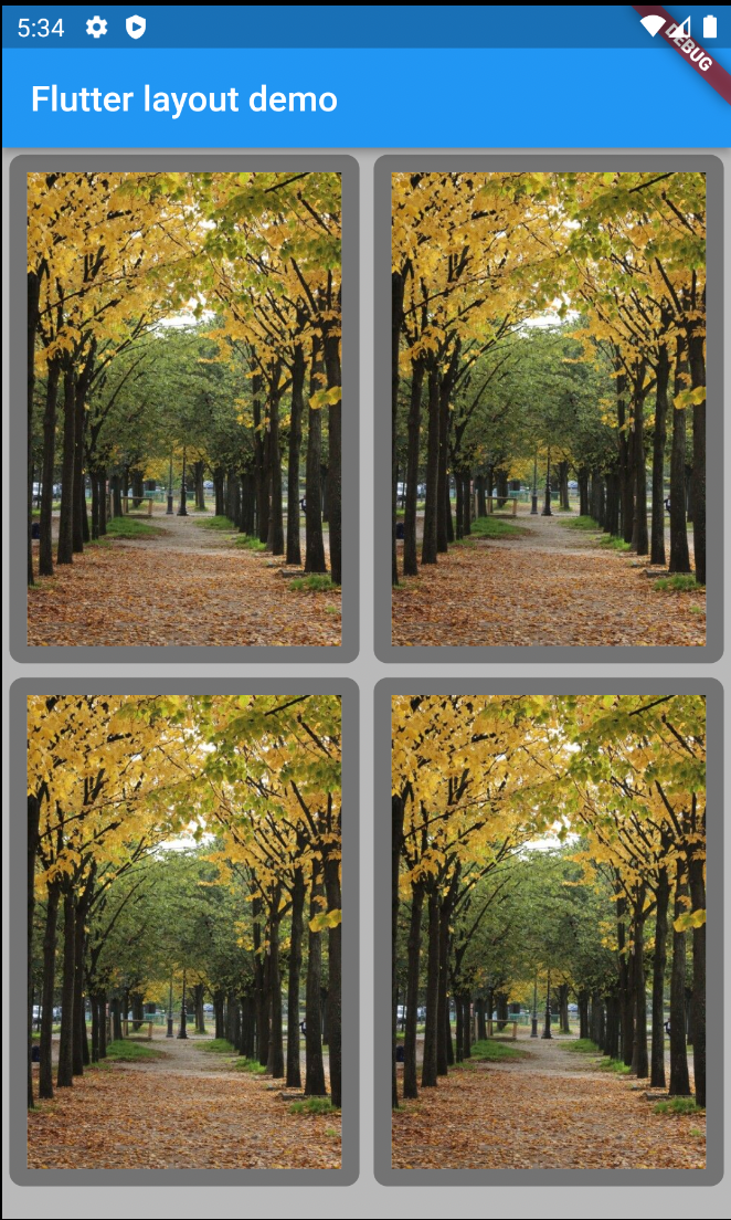
| import 'package:flutter/material.dart'; void main() { runApp(const MyApp()); } class MyApp extends StatelessWidget { const MyApp({super.key}); @override Widget build(BuildContext context) { return MaterialApp( title: 'Flutter layout demo', home: Scaffold( appBar: AppBar( title: const Text('Flutter layout demo'), ), body: Center(child: _buildImageColumn()), ), ); } Widget _buildImageColumn() { return Container( decoration: const BoxDecoration( // 박스의 내부를 아래 링크에서 볼 수 있는 회색으로 채웁니다. // https://api.flutter.dev/flutter/material/Colors/black-constant.html color: Colors.black26, ), // 자식 레이아웃으로 Column 레이아웃 위젯을 추가합니다. child: Column( // Column 레이아웃 위젯에는 2 개의 Row 레이아웃 위젯이 포함되어 있습니다. children: [ Row( // 한개의 Row 레이아웃 위젯에는 2개의 이미지가 포함되어 있습니다. children: [ // 자식 위젯의 크기를 최대한으로 확장해줍니다. Expanded( child: Container( decoration: BoxDecoration( // 박스에 아래 링크에서 볼 수 있는 회색의 너비 10인 테두리를 추가합니다. // https://api.flutter.dev/flutter/material/Colors/black-constant.html border: Border.all(width: 10, color: Colors.black38), // 박스 코너를 라운드로 합니다. borderRadius: const BorderRadius.all(Radius.circular(8)), ), // margin - 부모 위젯과의 여백을 지정합니다. // bottom, top, left, right 4가지 방향으로 여백을 4픽셀 추가합니다. margin: const EdgeInsets.all(4), // 자식 위젯으로 이미지를 추가합니다. child: Image.asset('assets/images/autom.jpg'), ), ), Expanded( child: Container( decoration: BoxDecoration( border: Border.all(width: 10, color: Colors.black38), borderRadius: const BorderRadius.all(Radius.circular(8)), ), margin: const EdgeInsets.all(4), child: Image.asset('assets/images/autom.jpg', ), ), ) ] ), Row( // 2개의 이미지가 포함되어 있습니다. children: [ Expanded( child: Container( decoration: BoxDecoration( border: Border.all(width: 10, color: Colors.black38), borderRadius: const BorderRadius.all(Radius.circular(8)), ), margin: const EdgeInsets.all(4), child: Image.asset('assets/images/autom.jpg'), ), ), Expanded( child: Container( decoration: BoxDecoration( border: Border.all(width: 10, color: Colors.black38), borderRadius: const BorderRadius.all(Radius.circular(8)), ), margin: const EdgeInsets.all(4), child: Image.asset('assets/images/autom.jpg', ), ), ) ] ), ], ), ); } } |
GridView
GridView는 위젯을 2차원 그리드에 배치합니다. 두 개의 라이브러리에서 제공되는 그리드를 사용하거나 커스텀 그리드를 사용할 수 있습니다. 화면 크기보다 콘텐츠가 많은 경우 스크롤이 가능하도록 해줍니다.
- GridView.count를 사용하면 열의 개수를 정할 수 있습니다.
- GridView.extent를 사용하면 타일(tile)의 최대 픽셀너비를 지정할 수 있습니다.

다음 예제에서는 GridView.extent을 사용하여 그리드에 있는 타일 하나의 너비를 150픽셀로 지정하고 있습니다.
| import 'package:flutter/material.dart'; void main() { runApp(const MyApp()); } class MyApp extends StatelessWidget { const MyApp({super.key}); @override Widget build(BuildContext context) { return MaterialApp( title: 'Flutter layout demo', home: Scaffold( appBar: AppBar( title: const Text('Flutter layout demo'), ), body: Center(child: _buildGrid()), ), ); } // #docregion grid Widget _buildGrid() => GridView.extent( // 타일의 너비를 150픽셀로 지정합니다. maxCrossAxisExtent: 150, // 패딩으로 4픽셀을 지정합니다. 그리드 상에 포함된 타일의 외부 여백입니다. padding: const EdgeInsets.all(4), // 세로방향 타일 간의 간격입니다. mainAxisSpacing: 4, // 가로방향 타일 간의 간격입니다. crossAxisSpacing: 4, // 자식 위젯으로 그리드에 이미지 30개를 추가합니다. children: _buildGridTileList(30)); // List.generate() 생성자를 사용하면 객체에 예측 가능한 이름 패턴이 있는 경우 리스트를 쉽게 만들 수 있습니다. // 아래 코드에선 원본 문서와 달리 똑같은 이미지를 사용하고 있습니다. List<Container> _buildGridTileList(int count) => List.generate( // count, (i) => Container(child: Image.asset('images/pic$i.jpg'))); count, (i) => Container(child: Image.asset('assets/images/autom.jpg'))); // #enddocregion grid } |
ListView
Column/Row 레이아웃 위젯처럼 자식 위젯을 세로/가로 방향으로 배치합니다. 자식 위젯이 화면에 보이는 것보다 많은 경우 스크롤을 지원합니다.
ListTile을 사용하여 레스토랑과 극장 리스트를 리스트뷰에 보여줍니다.
수평선을 사용하여 레스토랑과 극장 아이템을 구분하고 있습니다.

| import 'package:flutter/material.dart'; void main() { runApp(const MyApp()); } class MyApp extends StatelessWidget { const MyApp({super.key}); @override Widget build(BuildContext context) { return MaterialApp( title: 'Flutter layout demo', home: Scaffold( appBar: AppBar( title: const Text('Flutter layout demo'), ), body: Center(child: _buildList()), ), ); } // #docregion list Widget _buildList() { return ListView( children: [ _tile('CineArts at the Empire', '85 W Portal Ave', Icons.theaters), _tile('The Castro Theater', '429 Castro St', Icons.theaters), _tile('Alamo Drafthouse Cinema', '2550 Mission St', Icons.theaters), _tile('Roxie Theater', '3117 16th St', Icons.theaters), _tile('United Artists Stonestown Twin', '501 Buckingham Way', Icons.theaters), _tile('AMC Metreon 16', '135 4th St #3000', Icons.theaters), const Divider(), _tile('K\'s Kitchen', '757 Monterey Blvd', Icons.restaurant), _tile('Emmy\'s Restaurant', '1923 Ocean Ave', Icons.restaurant), _tile( 'Chaiya Thai Restaurant', '272 Claremont Blvd', Icons.restaurant), _tile('La Ciccia', '291 30th St', Icons.restaurant), ], ); } ListTile _tile(String title, String subtitle, IconData icon) { return ListTile( // ListTile에 보여지는 주된 문자열입니다. title: Text(title, style: const TextStyle( fontWeight: FontWeight.w500, fontSize: 20, )), // ListTile에 보여지는 보조 문자열입니다. subtitle: Text(subtitle), // leading - 아이콘을 Title 앞에 보여줍니다. leading: Icon( icon, color: Colors.blue[500], ), ); } // #enddocregion list } |
Stack
위젯이 다른 위젯 위에 표시되도록 할 수 있습니다. 첫번째 위젯이 맨 아래에 놓이고 그 다음 위젯이 첫번째 위젯 위에 올라가는 순으로 배치됩니다. 스택 위젯은 스크롤을 지원하지 않습니다.
스택 위젯을 사용하여 원형 안에 이미지가 있는 CircleAvatar 위젯 위에 텍스트 위젯을 보여주고 있습니다.

| import 'package:flutter/material.dart'; void main() { runApp(const MyApp()); } class MyApp extends StatelessWidget { const MyApp({super.key}); @override Widget build(BuildContext context) { return MaterialApp( title: 'Flutter layout demo', home: Scaffold( appBar: AppBar( title: const Text('Flutter layout demo'), ), body: Center(child: _buildStack()), ), ); } // #docregion Stack Widget _buildStack() { // 스택 위젯에 CircleAvatar 위젯이 자식으로 추가된 후 다음에 자식으로 추가된 Container 위젯에 포함된 Text 위젯이 CircleAvatar 위젯 위에 표시됩니다. return Stack( // 첫번째 자식인 CircleAvatar 위젯 위에 Container 위젯을 오른쪽 아래에 배치합니다. alignment: const Alignment(0.6, 0.6), children: [ // 보통 사용자 프로필 사진을 보여주기 위해 사용되며 원 안에 이미지를 보여줍니다. const CircleAvatar( backgroundImage: AssetImage('assets/images/autom.jpg'), radius: 100, ), // 텍스트 위젯의 배경을 검은색으로 하기 위해서 컨테이너 위젯을 사용합니다. Container( decoration: const BoxDecoration( color: Colors.black45, ), child: const Text( 'Mia B', style: TextStyle( fontSize: 20, fontWeight: FontWeight.bold, color: Colors.white, ), ), ), ], ); } // #enddocregion Stack } |
Card
Card 위젯만 사용하여 구성할 수도 있지만 보통 ListTile 위젯과 함께 사용됩니다. Card 위젯을 사용하여 둥근 코너와 그림자를 추가할 수 있습니다.
높이를 지정한 SizeBox 위젯의 자식 위젯으로 Card 위젯이 추가됩니다. Card 위젯에는 3개의 ListTile 위젯이 포함되어 있습니다. 각각의 ListTile 위젯에는 아이콘과 문자열이 포함되어 있습니다. Divider 위젯은 첫 번째 ListTile 위젯과 두 번째 ListTile 사이에 구분을 위해 수평선을 그리는 용도로 사용됩니다.

| import 'package:flutter/material.dart'; void main() { runApp(const MyApp()); } class MyApp extends StatelessWidget { const MyApp({super.key}); @override Widget build(BuildContext context) { return MaterialApp( title: 'Flutter layout demo', home: Scaffold( appBar: AppBar( title: const Text('Flutter layout demo'), ), body: Center(child: _buildCard()), ), ); } // #docregion Card Widget _buildCard() { // 높이를 210으로 고정합니다. return SizedBox( height: 210, // Card 위젯을 사용하면 사각 영역에 둥근 코너와 그림자가 보이게 됩니다. child: Card( // Column 위젯을 사용하여 Card 위젯에 세 개의 ListTile 위젯이 포함되도록 합니다. child: Column( children: [ // ListTile에는 두 개의 문자열(title, subtitle)과 한 개의 아이콘이 포함됩니다. ListTile( title: const Text( '1625 Main Street', style: TextStyle(fontWeight: FontWeight.w500), ), subtitle: const Text('My City, CA 99984'), leading: Icon( Icons.restaurant_menu, color: Colors.blue[500], ), ), // 두 개의 ListTile 위젯 사이에 수평선을 추가해줍니다. const Divider(), ListTile( title: const Text( '(408) 555-1212', style: TextStyle(fontWeight: FontWeight.w500), ), leading: Icon( Icons.contact_phone, color: Colors.blue[500], ), ), ListTile( title: const Text('costa@example.com'), leading: Icon( Icons.contact_mail, color: Colors.blue[500], ), ), ], ), ), ); } // #enddocregion Card } |
ListTile
ListTile 위젯에는 최대 3개의 문자열과 아이콘 하나를 추가할 수 있습니다. 아이콘은 문자열 앞에 혹은 문자열 뒤에 배치할 수 있습니다.

첫번째 예제 코드는 Card 위젯 예제와 동일합니다.
ListView 위젯에 다수의 ListTile을 배치하는 예제입니다.

| import 'package:flutter/material.dart'; void main() { runApp(const MyApp()); } class MyApp extends StatelessWidget { const MyApp({super.key}); @override Widget build(BuildContext context) { return MaterialApp( title: "ListsTitle", home: Scaffold( appBar: AppBar( title: Text('MaterialApp'), centerTitle: true, ), body:Scrollbar( child: ListView( restorationId: 'list_demo_list_view', // EdgeInsets.symmetric(vertical: 8) - 위 아래에 여백으로 8 픽셀을 추가합니다. padding: const EdgeInsets.symmetric(vertical: 8), children: [ // 20개의 ListTile 위젯을 자식 위젯으로 추가합니다. for (int index = 1; index < 21; index++) ListTile( // 숫자가 적힌 동그라미를 아이콘 자리에 배치합니다. leading: ExcludeSemantics( child: CircleAvatar(child: Text('$index')), ), title: Text( "Title", ), subtitle: Text("subtitle") ), ], ), ) ) ); } } |
'Flutter > Flutter 강좌' 카테고리의 다른 글
| Flutter 프로젝트에 이미지 파일 추가하여 사용하기 (0) | 2023.10.18 |
|---|---|
| Flutter 강좌 03 - 위젯 간단히 살펴보기 (0) | 2023.10.18 |
| Flutter 강좌 02 - Flutter에서 StatefulWidget과 StatelessWidget의 차이 정리 (0) | 2023.10.18 |
| Flutter 강좌 01 - 첫번째 앱 작성하기 (0) | 2023.10.18 |
시간날때마다 틈틈이 이것저것 해보며 블로그에 글을 남깁니다.
블로그의 문서는 종종 최신 버전으로 업데이트됩니다.
여유 시간이 날때 진행하는 거라 언제 진행될지는 알 수 없습니다.
영화,책, 생각등을 올리는 블로그도 운영하고 있습니다.
https://freewriting2024.tistory.com
제가 쓴 책도 한번 검토해보세요 ^^