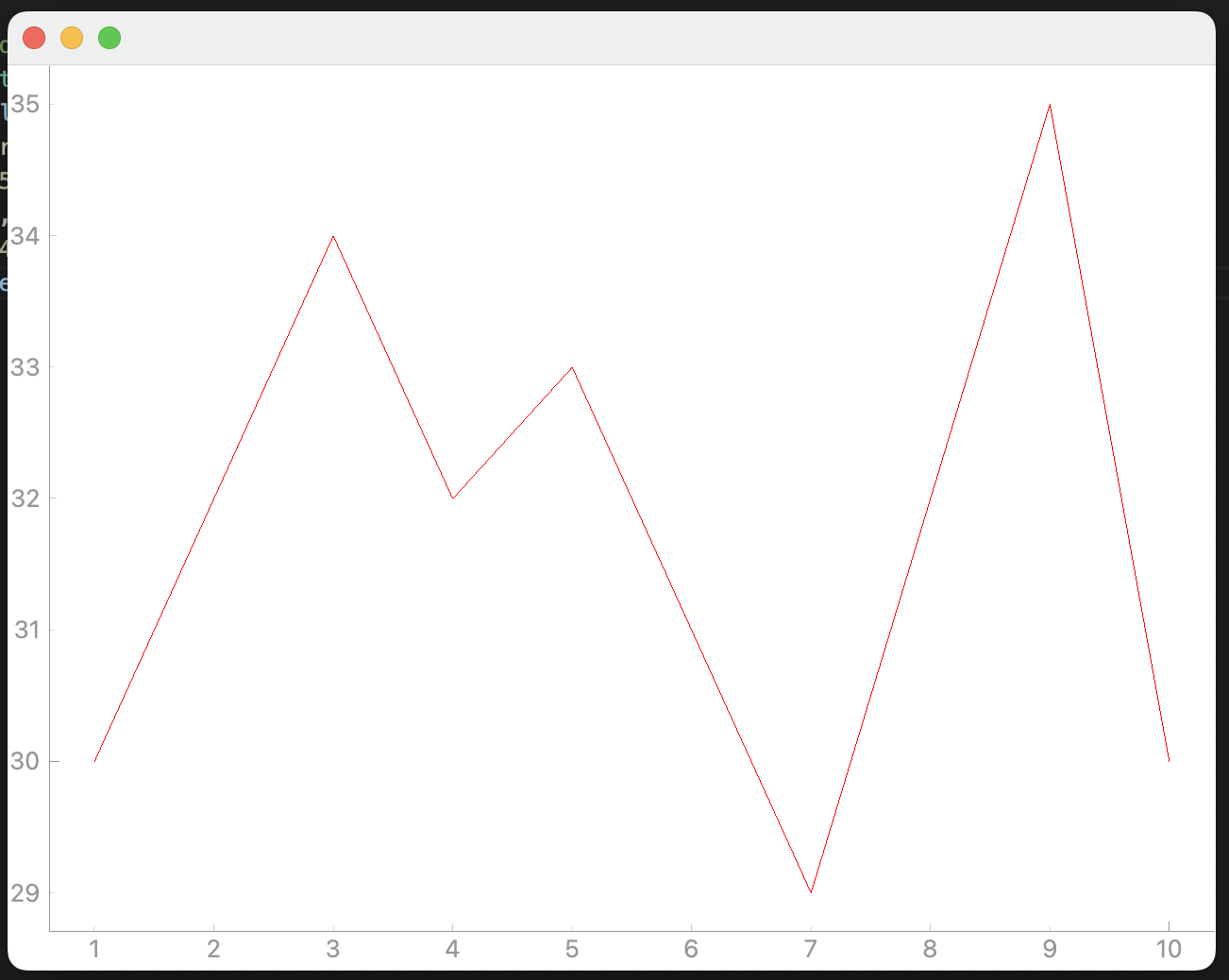
PyQtGraph 라이브러리를 사용하여 PyQt에서 그래프 그리는 예제 코드입니다.
2024. 2. 5 최초작성
다음 2개의 패키지를 설치해야 합니다.
pip install pyqtgraph PyQt5
디폴트 배경색은 검은색이기 때문에 흰색으로 변경할 필요가 있습니다.
아래 예제 코드에서는 setBackground 메소드에 w를 지정하여 배경색이 흰색이 됩니다.
| import pyqtgraph as pg from PyQt5 import QtWidgets class MainWindow(QtWidgets.QMainWindow): def __init__(self): super().__init__() # Temperature vs time plot self.plot_graph = pg.PlotWidget() self.setCentralWidget(self.plot_graph) self.plot_graph.setBackground("w") time = [1, 2, 3, 4, 5, 6, 7, 8, 9, 10] temperature = [30, 32, 34, 32, 33, 31, 29, 32, 35, 30] self.plot_graph.plot(time, temperature) app = QtWidgets.QApplication([]) main = MainWindow() main.show() app.exec() |

배경색으로 많이 지정하는 배경색은 다음과 같습니다. Matplotlib에서 사용되는 방식으로 색을 지정합니다.

16진수 형식으로 색을 지정할 수도 있습니다.
| self.plot_graph.setBackground("#fff8dc") |
RGB 또는 RGBA 형식으로 지정할 수 도 있습니다. RGBA는 RGB에 색의 투명도인 알파 채널을 추가한 것입니다.
RGB를 사용하여 색을 지정한 예입니다.
| self.plot_graph.setBackground((255, 160, 122)) |
RGBA를 사용하여 색지정한 예입니다. 앞에서 지정한 RGB 값에 알파채널값을 30으로 해봅니다. 배경색이 투명해진걸 볼 수 있습니다.
| self.plot_graph.setBackground((255, 160, 122, 30)) |
16진수(HEX) 색 / RGB 색 지정 예는 아래 표를 확인하세요.
( 이미지 출처 - https://mayburilova.wordpress.com/2010/11/02/hexadecimal-colors/ )

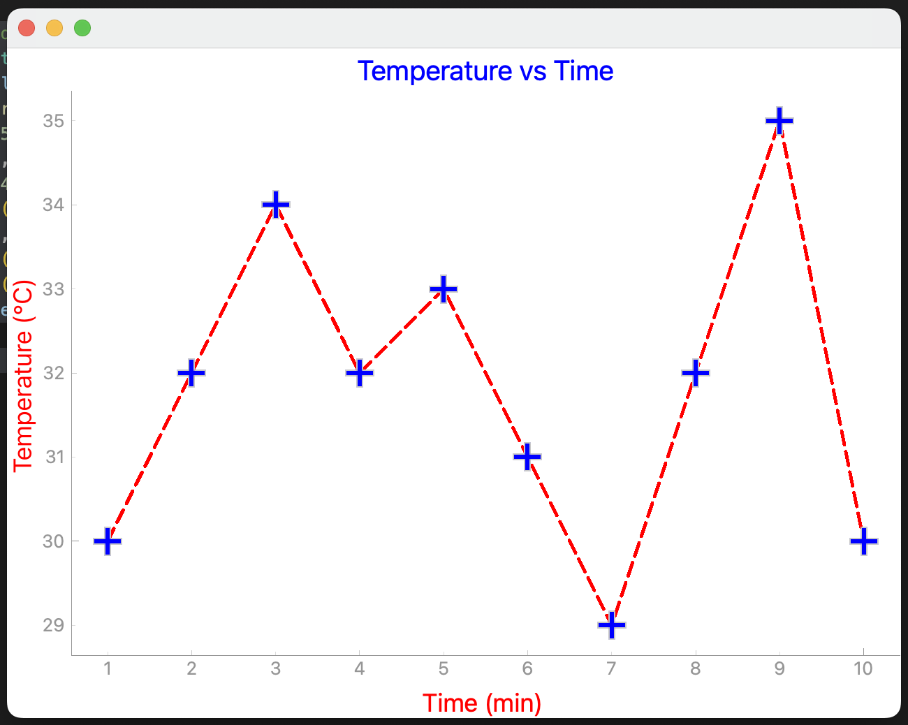
그래프 선 색깔을 빨간색으로 지정하는 예제코드입니다. 선 색을 ( r, g, b)로 지정합니다.
| import pyqtgraph as pg from PyQt5 import QtWidgets class MainWindow(QtWidgets.QMainWindow): def __init__(self): super().__init__() # Temperature vs time plot self.plot_graph = pg.PlotWidget() self.setCentralWidget(self.plot_graph) self.plot_graph.setBackground("w") pen = pg.mkPen(color=(255, 0, 0)) time = [1, 2, 3, 4, 5, 6, 7, 8, 9, 10] temperature = [30, 32, 34, 32, 33, 31, 29, 32, 35, 30] self.plot_graph.plot(time, temperature, pen=pen) app = QtWidgets.QApplication([]) main = MainWindow() main.show() app.exec() |
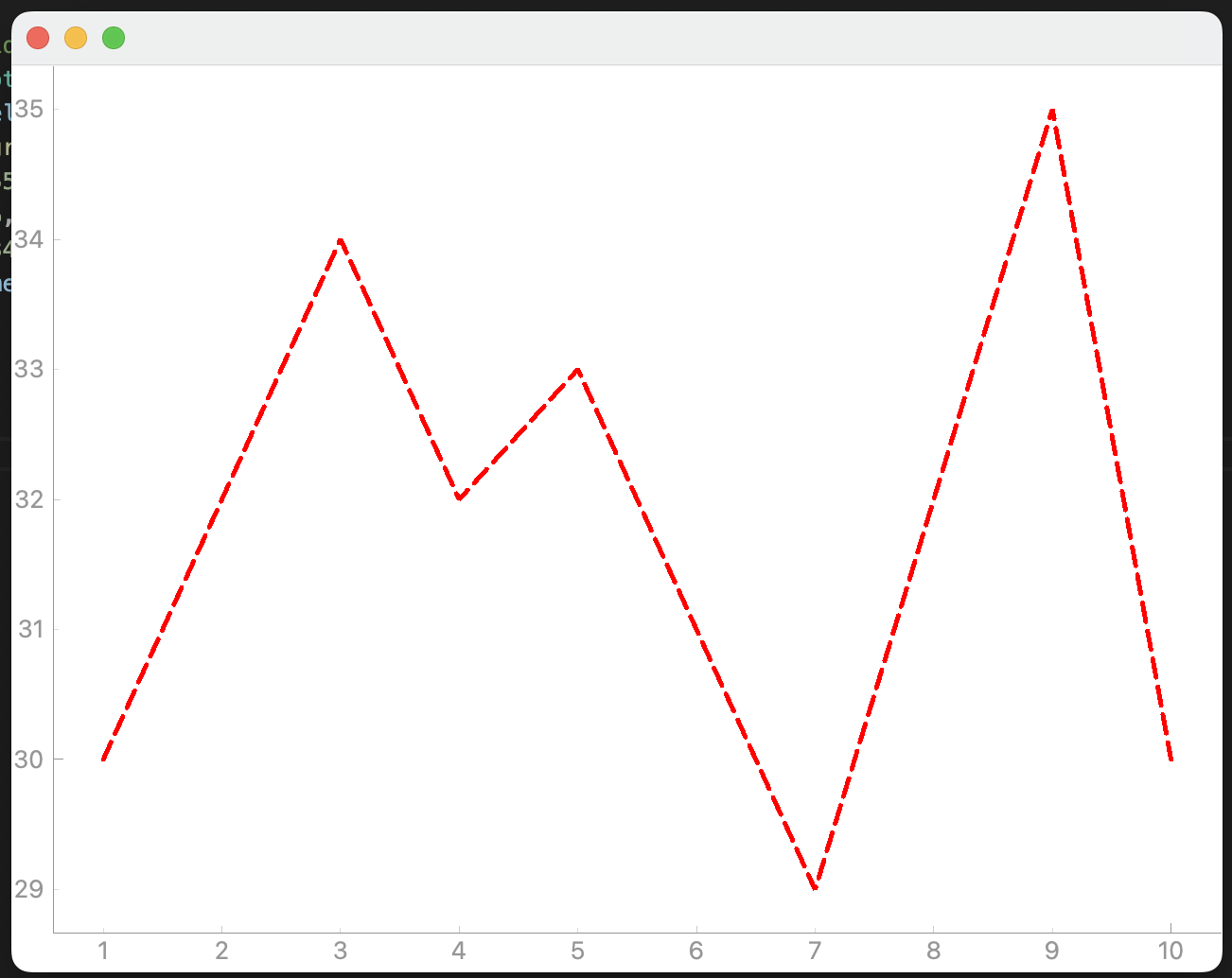
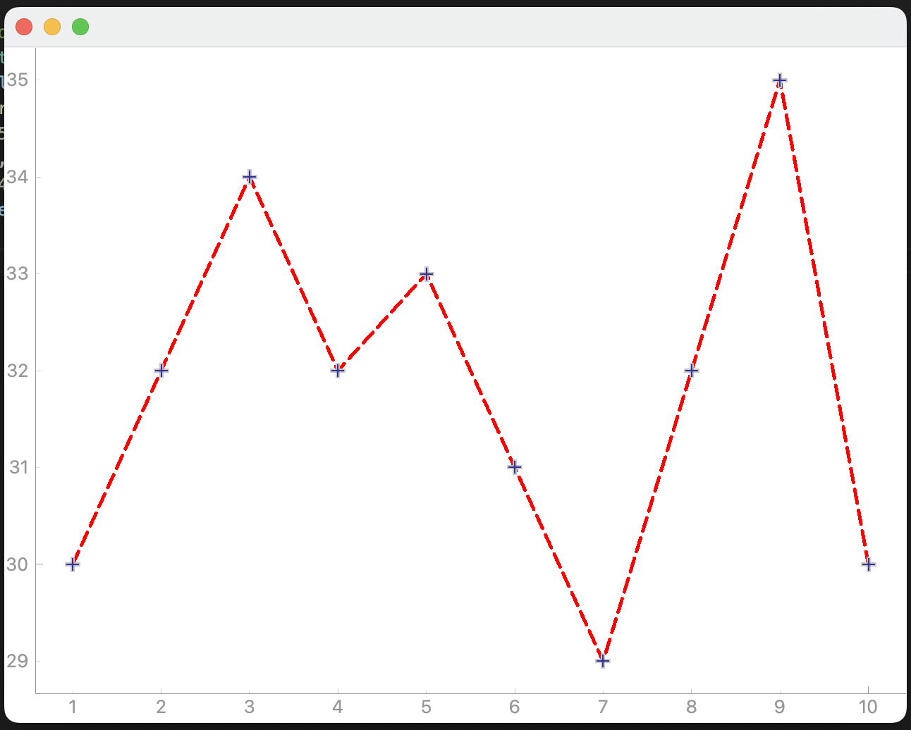
선 굵기를 5로 조정하고 선의 타입을 대시로 변경합니다.
| import pyqtgraph as pg from PyQt5 import QtWidgets, QtCore class MainWindow(QtWidgets.QMainWindow): def __init__(self): super().__init__() # Temperature vs time plot self.plot_graph = pg.PlotWidget() self.setCentralWidget(self.plot_graph) self.plot_graph.setBackground("w") pen = pg.mkPen(color=(255, 0, 0), width=5, style=QtCore.Qt.DashLine) time = [1, 2, 3, 4, 5, 6, 7, 8, 9, 10] temperature = [30, 32, 34, 32, 33, 31, 29, 32, 35, 30] self.plot_graph.plot(time, temperature, pen=pen) app = QtWidgets.QApplication([]) main = MainWindow() main.show() app.exec() |
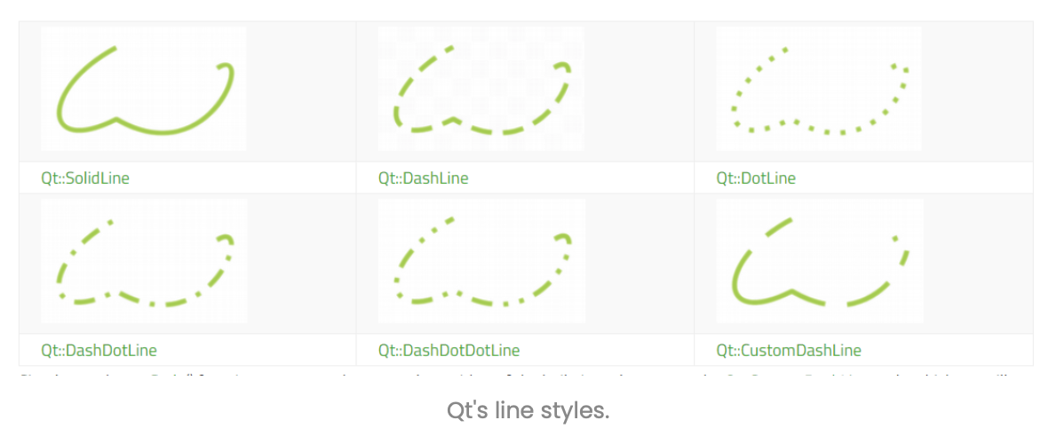
사용가능한 선 타입은 다음과 같습니다. ( 이미지 출처 https://www.pythonguis.com/tutorials/plotting-pyqtgraph/ )
데이터 포인트마다 마커를 추가합니다.
| import pyqtgraph as pg from PyQt5 import QtWidgets, QtCore class MainWindow(QtWidgets.QMainWindow): def __init__(self): super().__init__() # Temperature vs time plot self.plot_graph = pg.PlotWidget() self.setCentralWidget(self.plot_graph) self.plot_graph.setBackground("w") pen = pg.mkPen(color=(255, 0, 0), width=5, style=QtCore.Qt.DashLine) time = [1, 2, 3, 4, 5, 6, 7, 8, 9, 10] temperature = [30, 32, 34, 32, 33, 31, 29, 32, 35, 30] self.plot_graph.plot(time, temperature, pen=pen, symbol="+") app = QtWidgets.QApplication([]) main = MainWindow() main.show() app.exec() |
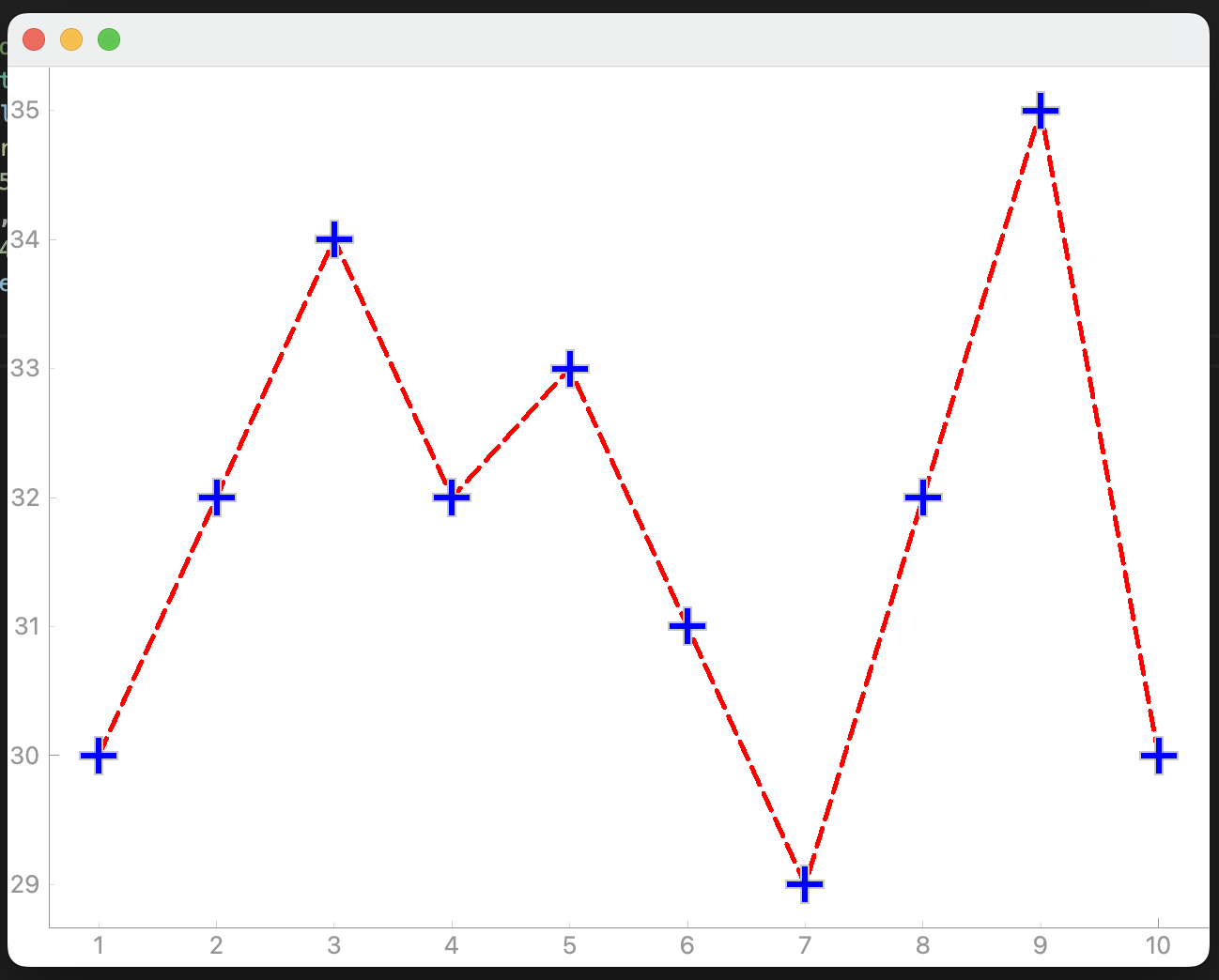
마커를 커스터마이즈한 예제입니다.
| import pyqtgraph as pg from PyQt5 import QtWidgets, QtCore class MainWindow(QtWidgets.QMainWindow): def __init__(self): super().__init__() # Temperature vs time plot self.plot_graph = pg.PlotWidget() self.setCentralWidget(self.plot_graph) self.plot_graph.setBackground("w") pen = pg.mkPen(color=(255, 0, 0), width=5, style=QtCore.Qt.DashLine) time = [1, 2, 3, 4, 5, 6, 7, 8, 9, 10] temperature = [30, 32, 34, 32, 33, 31, 29, 32, 35, 30] self.plot_graph.plot(time, temperature, pen=pen, symbol="+", symbolSize=20, symbolBrush="b") app = QtWidgets.QApplication([]) main = MainWindow() main.show() app.exec() |
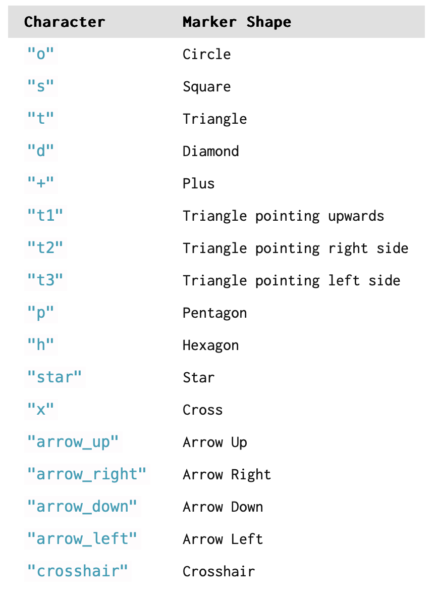
+마커 외에 사용가능한 마커 종류입니다. ( 이미지 출처 https://www.pythonguis.com/tutorials/plotting-pyqtgraph/ )
그래프에 제목을 추가하고 좌표축에 라벨을 추가합니다.
| import pyqtgraph as pg from PyQt5 import QtWidgets, QtCore class MainWindow(QtWidgets.QMainWindow): def __init__(self): super().__init__() # Temperature vs time plot self.plot_graph = pg.PlotWidget() self.setCentralWidget(self.plot_graph) self.plot_graph.setBackground("w") pen = pg.mkPen(color=(255, 0, 0), width=5, style=QtCore.Qt.DashLine) time = [1, 2, 3, 4, 5, 6, 7, 8, 9, 10] temperature = [30, 32, 34, 32, 33, 31, 29, 32, 35, 30] self.plot_graph.setTitle("Temperature vs Time", color="b", size="20pt") # 그래프 제목 styles = {"color": "red", "font-size": "18px"} self.plot_graph.setLabel("left", "Temperature (°C)", **styles) # y축 라벨 self.plot_graph.setLabel("bottom", "Time (min)", **styles) # x축 라벨 self.plot_graph.plot(time, temperature, pen=pen, symbol="+", symbolSize=20, symbolBrush="b") app = QtWidgets.QApplication([]) main = MainWindow() main.show() app.exec() |
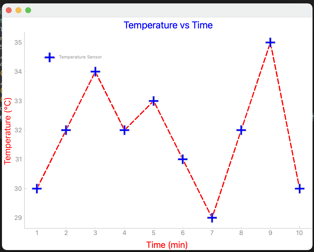
범례가 보이려면 그래프를 그려주는 plot 메소드에 name 속성을 추가해야 합니다.
| import pyqtgraph as pg from PyQt5 import QtWidgets, QtCore class MainWindow(QtWidgets.QMainWindow): def __init__(self): super().__init__() # Temperature vs time plot self.plot_graph = pg.PlotWidget() self.setCentralWidget(self.plot_graph) self.plot_graph.setBackground("w") pen = pg.mkPen(color=(255, 0, 0), width=5, style=QtCore.Qt.DashLine) time = [1, 2, 3, 4, 5, 6, 7, 8, 9, 10] temperature = [30, 32, 34, 32, 33, 31, 29, 32, 35, 30] self.plot_graph.setTitle("Temperature vs Time", color="b", size="20pt") styles = {"color": "red", "font-size": "18px"} self.plot_graph.setLabel("left", "Temperature (°C)", **styles) self.plot_graph.setLabel("bottom", "Time (min)", **styles) self.plot_graph.addLegend() self.plot_graph.plot(time, temperature, pen=pen, name="Temperature Sensor", symbol="+", symbolSize=20, symbolBrush="b") # name을 추가해야 합니다. app = QtWidgets.QApplication([]) main = MainWindow() main.show() app.exec() |
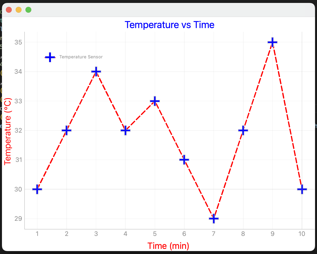
그래프가 그려지는 배경에 x축과 y축 그리드를 추가합니다.
| import pyqtgraph as pg from PyQt5 import QtWidgets, QtCore class MainWindow(QtWidgets.QMainWindow): def __init__(self): super().__init__() # Temperature vs time plot self.plot_graph = pg.PlotWidget() self.setCentralWidget(self.plot_graph) self.plot_graph.setBackground("w") pen = pg.mkPen(color=(255, 0, 0), width=5, style=QtCore.Qt.DashLine) time = [1, 2, 3, 4, 5, 6, 7, 8, 9, 10] temperature = [30, 32, 34, 32, 33, 31, 29, 32, 35, 30] self.plot_graph.setTitle("Temperature vs Time", color="b", size="20pt") styles = {"color": "red", "font-size": "18px"} self.plot_graph.setLabel("left", "Temperature (°C)", **styles) self.plot_graph.setLabel("bottom", "Time (min)", **styles) self.plot_graph.addLegend() self.plot_graph.showGrid(x=True, y=True) self.plot_graph.plot(time, temperature, pen=pen, name="Temperature Sensor", symbol="+", symbolSize=20, symbolBrush="b") # name을 추가해야 합니다. app = QtWidgets.QApplication([]) main = MainWindow() main.show() app.exec() |
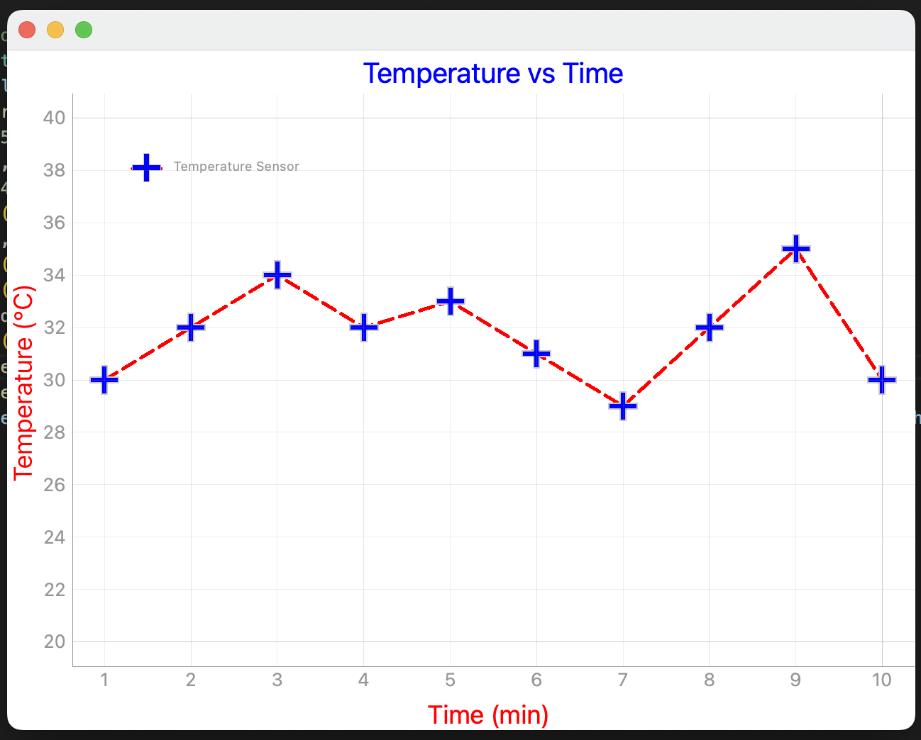
축 범위를 지정합니다.
| import pyqtgraph as pg from PyQt5 import QtWidgets, QtCore class MainWindow(QtWidgets.QMainWindow): def __init__(self): super().__init__() # Temperature vs time plot self.plot_graph = pg.PlotWidget() self.setCentralWidget(self.plot_graph) self.plot_graph.setBackground("w") pen = pg.mkPen(color=(255, 0, 0), width=5, style=QtCore.Qt.DashLine) time = [1, 2, 3, 4, 5, 6, 7, 8, 9, 10] temperature = [30, 32, 34, 32, 33, 31, 29, 32, 35, 30] self.plot_graph.setTitle("Temperature vs Time", color="b", size="20pt") styles = {"color": "red", "font-size": "18px"} self.plot_graph.setLabel("left", "Temperature (°C)", **styles) self.plot_graph.setLabel("bottom", "Time (min)", **styles) self.plot_graph.addLegend() self.plot_graph.showGrid(x=True, y=True) self.plot_graph.setXRange(1, 10) self.plot_graph.setYRange(20, 40) self.plot_graph.plot(time, temperature, pen=pen, name="Temperature Sensor", symbol="+", symbolSize=20, symbolBrush="b") # name을 추가해야 합니다. app = QtWidgets.QApplication([]) main = MainWindow() main.show() app.exec() |
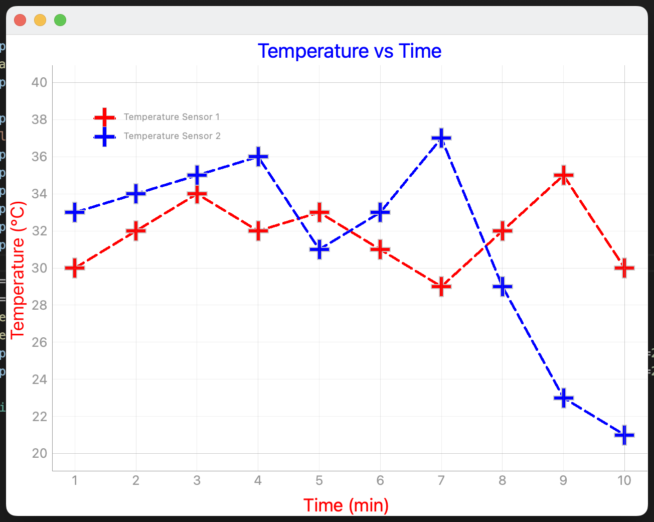
그래프 여러개를 그려주는 예제 코드입니다.
| import pyqtgraph as pg from PyQt5 import QtWidgets, QtCore class MainWindow(QtWidgets.QMainWindow): def __init__(self): super().__init__() # Temperature vs time plot self.plot_graph = pg.PlotWidget() self.setCentralWidget(self.plot_graph) self.plot_graph.setBackground("w") time = [1, 2, 3, 4, 5, 6, 7, 8, 9, 10] self.plot_graph.setTitle("Temperature vs Time", color="b", size="20pt") styles = {"color": "red", "font-size": "18px"} self.plot_graph.setLabel("left", "Temperature (°C)", **styles) self.plot_graph.setLabel("bottom", "Time (min)", **styles) self.plot_graph.addLegend() self.plot_graph.showGrid(x=True, y=True) self.plot_graph.setXRange(1, 10) self.plot_graph.setYRange(20, 40) temperature1 = [30, 32, 34, 32, 33, 31, 29, 32, 35, 30] temperature2 = [33, 34, 35, 36, 31, 33, 37, 29, 23, 21] pen1 = pg.mkPen(color=(255, 0, 0), width=5, style=QtCore.Qt.DashLine) pen2 = pg.mkPen(color=(0, 0, 255), width=5, style=QtCore.Qt.DashLine) self.plot_graph.plot(time, temperature1, pen=pen1, name="Temperature Sensor 1", symbol="+", symbolSize=20, symbolBrush="r") # name을 추가해야 합니다. self.plot_graph.plot(time, temperature2, pen=pen2, name="Temperature Sensor 2", symbol="+", symbolSize=20, symbolBrush="b") # name을 추가해야 합니다. app = QtWidgets.QApplication([]) main = MainWindow() main.show() app.exec() |
동적으로 그래프를 그려주는 예제코드입니다.
| import pyqtgraph as pg from PyQt5 import QtWidgets, QtCore from random import randint from pyqtgraph import LegendItem class MainWindow(QtWidgets.QMainWindow): def __init__(self): super().__init__() # Temperature vs time plot self.plot_graph = pg.PlotWidget() self.setCentralWidget(self.plot_graph) self.plot_graph.setBackground("w") self.pen = pg.mkPen(color=(255, 0, 0), width=5, style=QtCore.Qt.DashLine) # 좀 더 많은 데이터를 생성합니다. self.time = list(range(50)) self.temperature = [randint(20, 40) for _ in range(50)] self.plot_graph.setTitle("Temperature vs Time", color="b", size="20pt") styles = {"color": "red", "font-size": "18px"} self.plot_graph.setLabel("left", "Temperature (°C)", **styles) self.plot_graph.setLabel("bottom", "Time (min)", **styles) # self.plot_graph.addLegend() self.plot_graph.showGrid(x=True, y=True) # self.plot_graph.setXRange(1, 10) # self.plot_graph.setYRange(20, 40) self.graph = self.plot_graph.plot([], [], pen=self.pen, name="Temperature Sensor", symbol="+", symbolSize=20, symbolBrush="b") # name을 추가해야 합니다. # 300ms마다 타이머에서 지정한 함수가 호출됩니다. self.timer = QtCore.QTimer() self.timer.setInterval(300) self.timer.timeout.connect(self.update_plot) self.timer.start() self.i = 1 def update_plot(self): time = self.time[:self.i] temperature = self.temperature[:self.i] self.graph.setData(time, temperature) self.plot_graph.setXRange(self.i-10, self.i) self.i = self.i + 1 app = QtWidgets.QApplication([]) main = MainWindow() main.show() app.exec() |
참고
https://www.pythonguis.com/tutorials/plotting-pyqtgraph/
'Qt > PyQt5 강좌' 카테고리의 다른 글
| PyQt5 예제 - 단축키로 버튼 누르기 (0) | 2024.04.12 |
|---|---|
| PyQtGraph 다른 모니터로 윈도우 이동시 그래프가 깨지는 현상 해결 방법 (0) | 2024.02.21 |
| PyQt5와 QML을 사용하는 간단한 예제 (0) | 2023.12.11 |
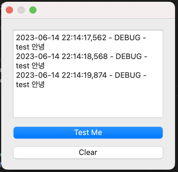
| logging과 PyQt5를 사용하여 로그창 구현 (0) | 2023.10.22 |
| PyQT5에서 slot이 thread-safe인지 테스트 해봤습니다 (0) | 2023.10.22 |
시간날때마다 틈틈이 이것저것 해보며 블로그에 글을 남깁니다.
블로그의 문서는 종종 최신 버전으로 업데이트됩니다.
여유 시간이 날때 진행하는 거라 언제 진행될지는 알 수 없습니다.
블로그 글과 유튜브 영상을 만드는 것은 전문가라서라기보단 공부한 내용을 함께 공유하는 게 좋아서입니다.
제가 쓴 책도 한번 검토해보세요 ^^